A precise visual identity for a studio where productions can change worlds without changing locations.
00 / Overview
Giving a virtual production studio a confident, cinematic signature.
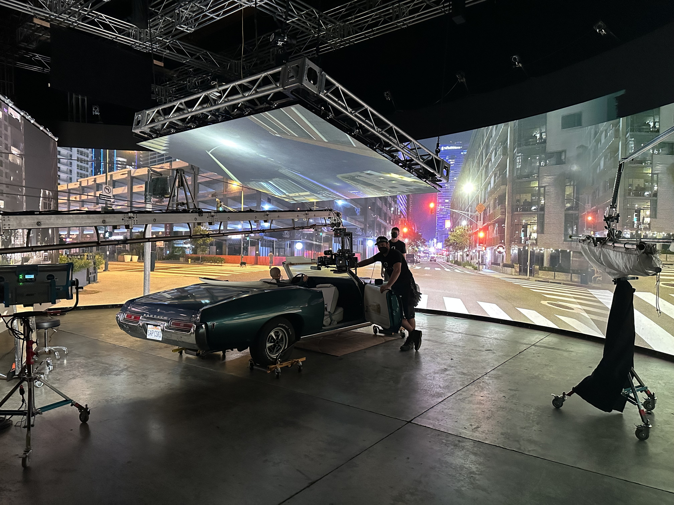
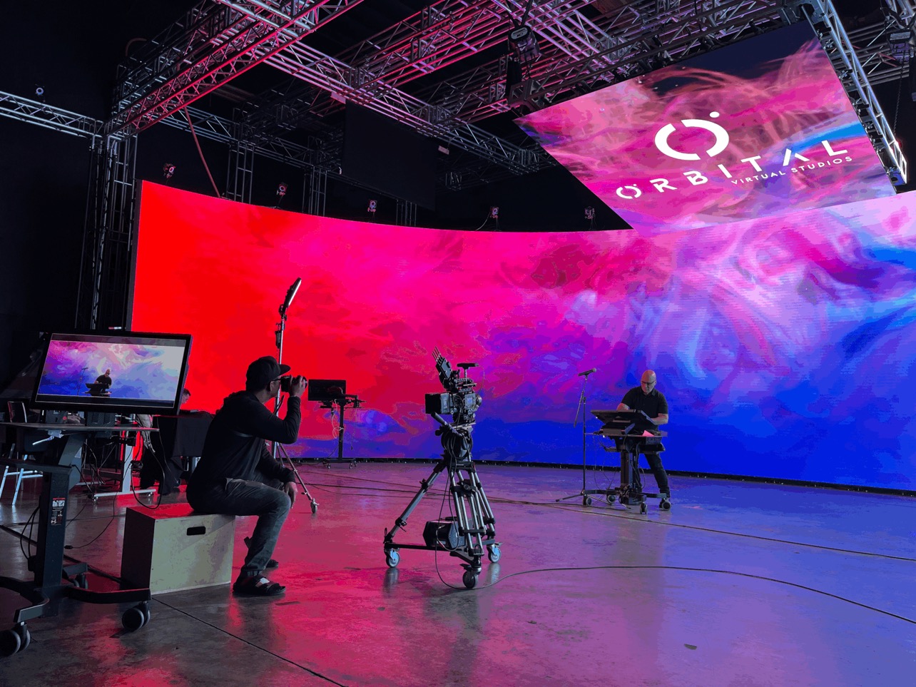
Agency689 created the logo and identity for Orbital’s new virtual production environment, built to work across the stage, presentations, digital materials, and client applications.
Agency role Visual Identity Partner
Client Orbital Virtual Studios
Services Logo Design / Visual Identity / Color System / Brand Applications
01 / Logo Design
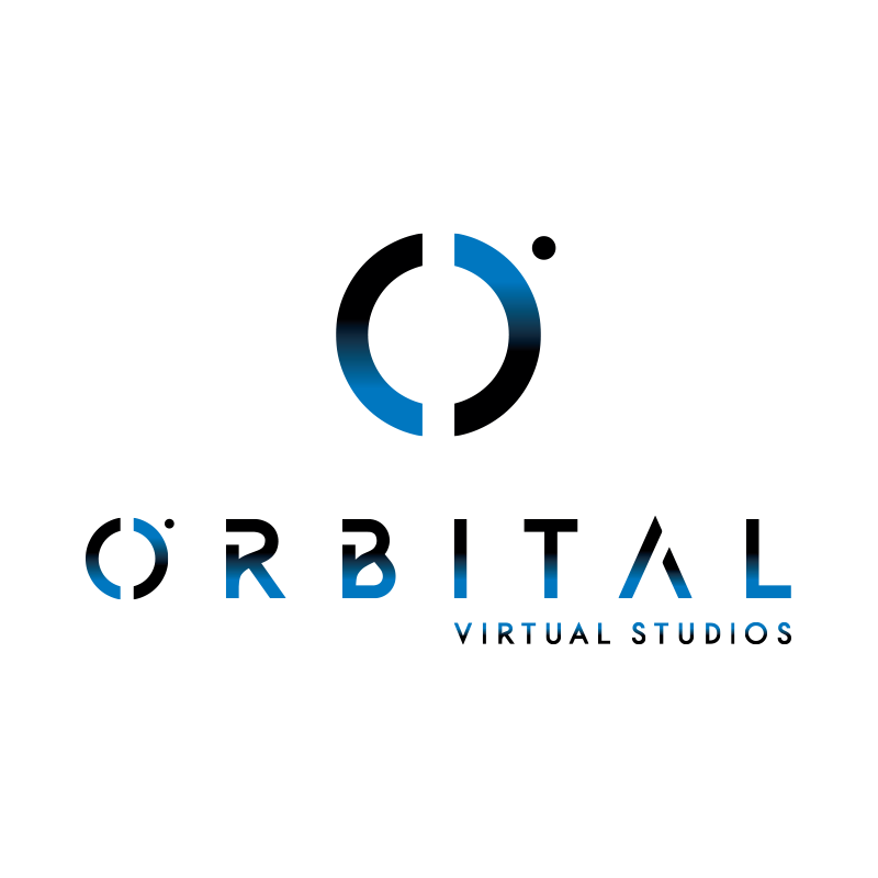
Motion and spatial precision in a single mark.
Circular geometry suggests rotation and the controlled movement of virtual environments. A restrained wordmark balances that energy and lets the identity support stage graphics, presentations, and client productions without competing with them.
02 / Identity System
Enough presence for the stage. Enough restraint for the work.
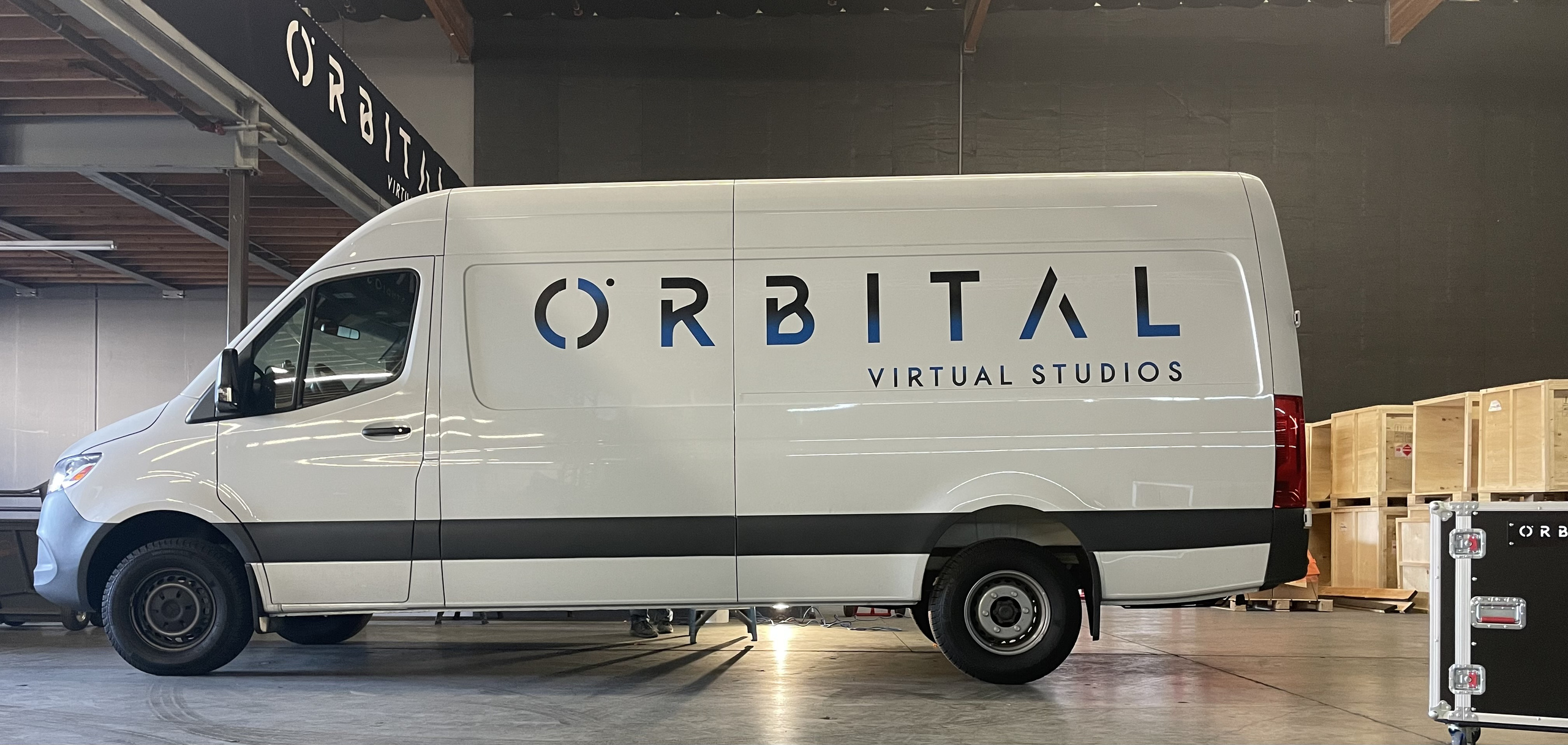
A blue-and-black palette gave the studio technical, cinematic presence without competing with the worlds created on its stage.
Facing a similar challenge?