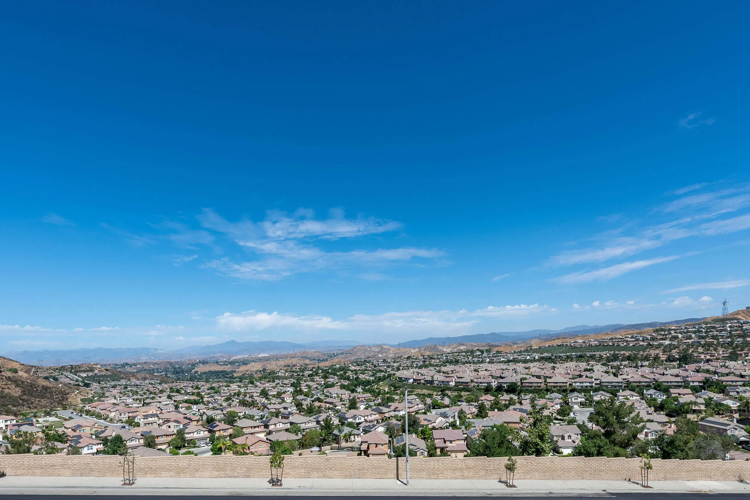
A hilltop apartment community named and designed around one defining advantage: perspective.
00 / Overview
A multifamily brand shaped by the property’s strongest advantage: the view.
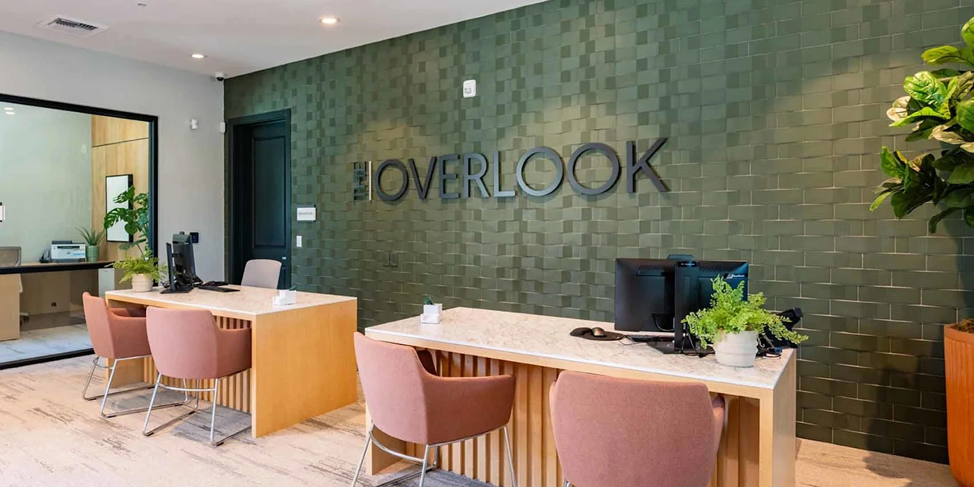
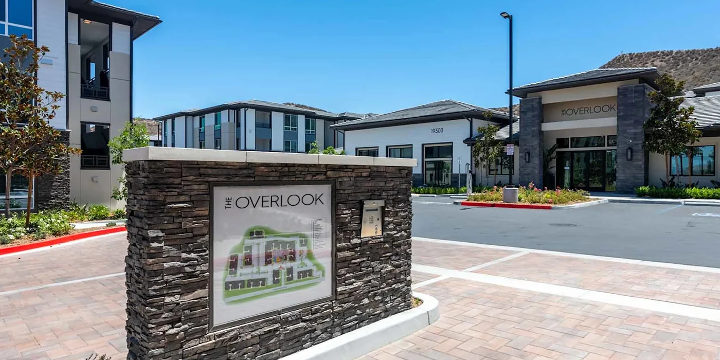
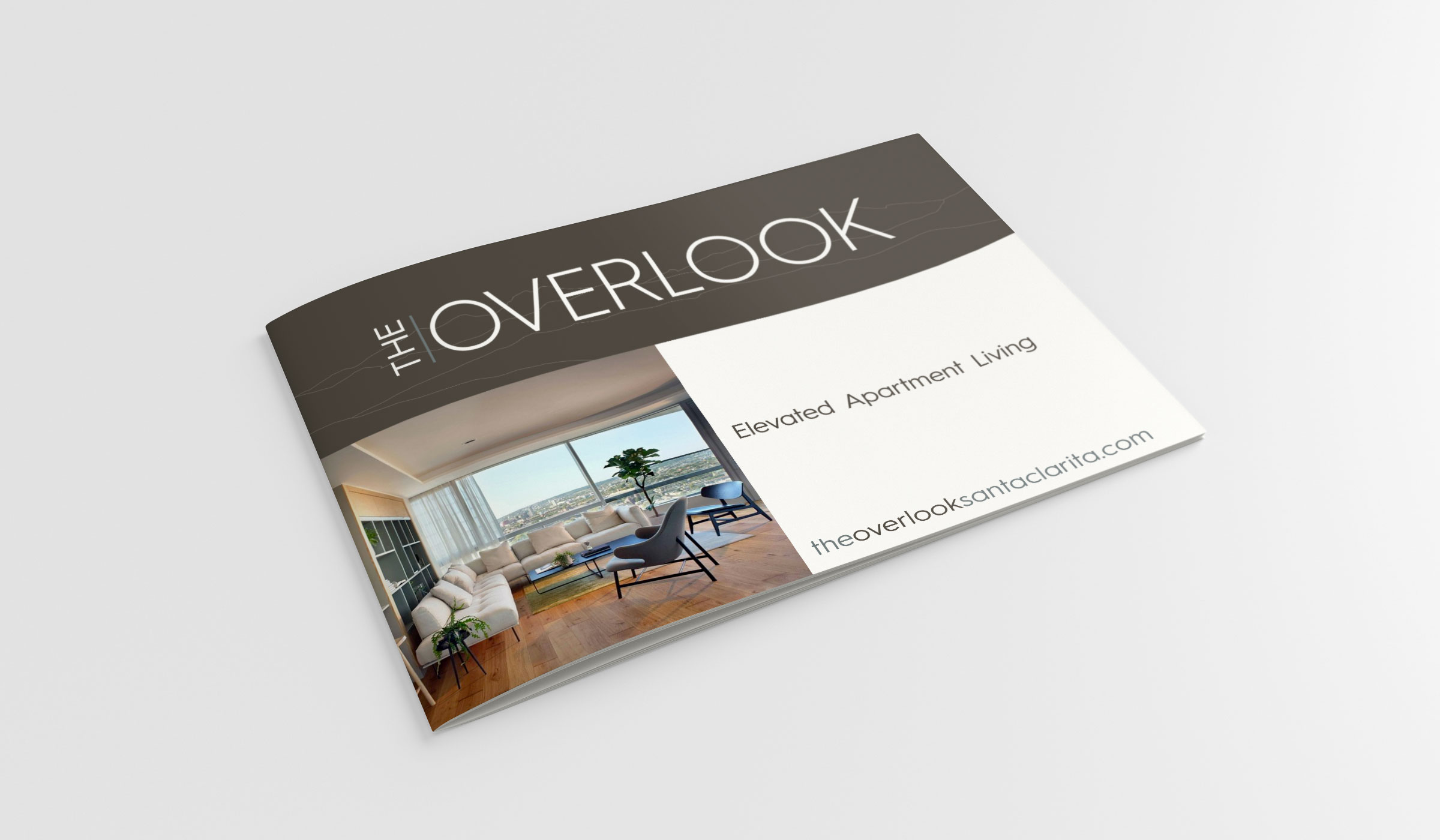
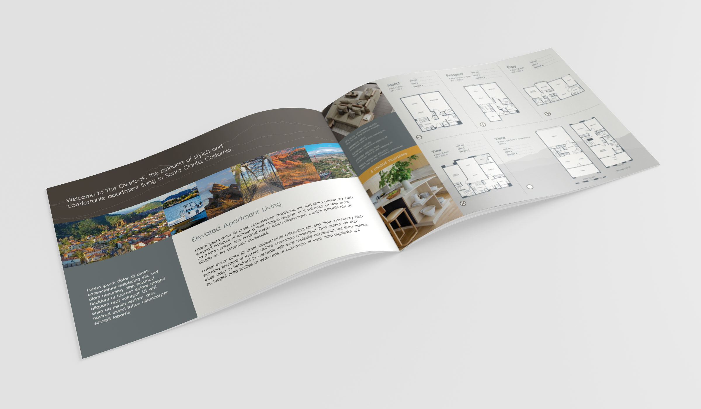
The Overlook needed an identity before prospects could experience the property. Its position above Santa Clarita inspired the name and a residential brand connecting the logo, architectural color, signage, interiors, and leasing materials.
Agency role Lead strategy and creative partner
Client The Overlook
Services Naming Collaboration / Multifamily Brand Strategy / Visual Identity / Logo Design / Environmental Color Direction / Property Signage / Leasing Collateral
01 / Naming and Positioning
Naming the perspective.
“The Overlook” made the property’s vantage point immediate and memorable. It established a residential position centered on openness, elevation, and a broader view of the city, then guided the mark, color direction, environment, and leasing story.
02 / Visual Identity
Restraint became the system.
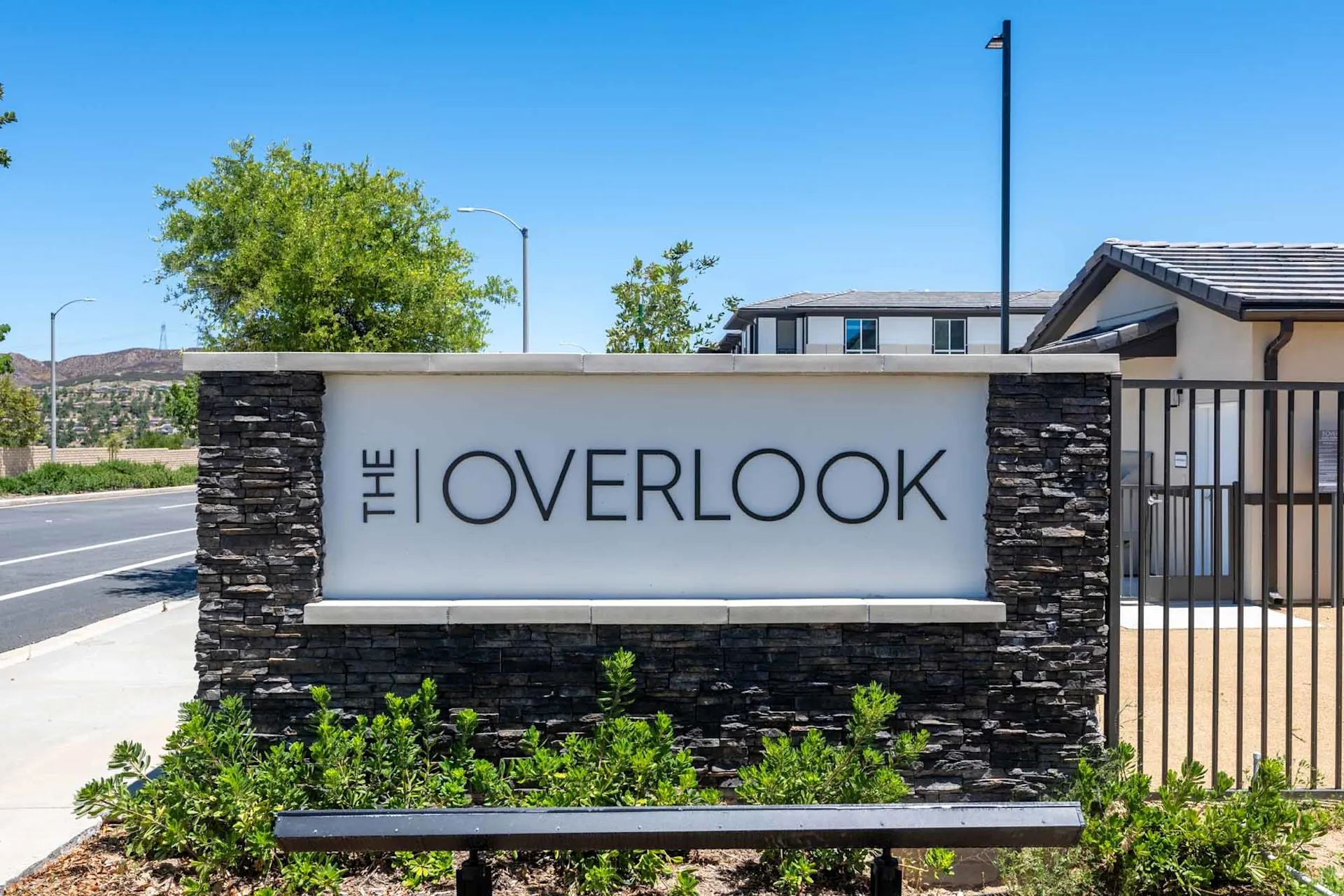
Consistent proportions, disciplined typography, and a controlled palette gave the community a composed presence. Site plans, architectural studies, materials, and sketches kept those choices grounded in the approach, landscape, light, and resident experience.


03 / Environment and Leasing
One identity, from first impression to front door.
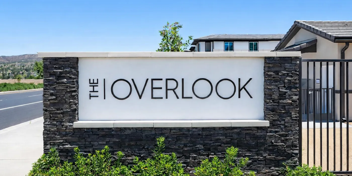
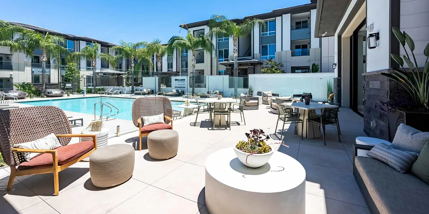
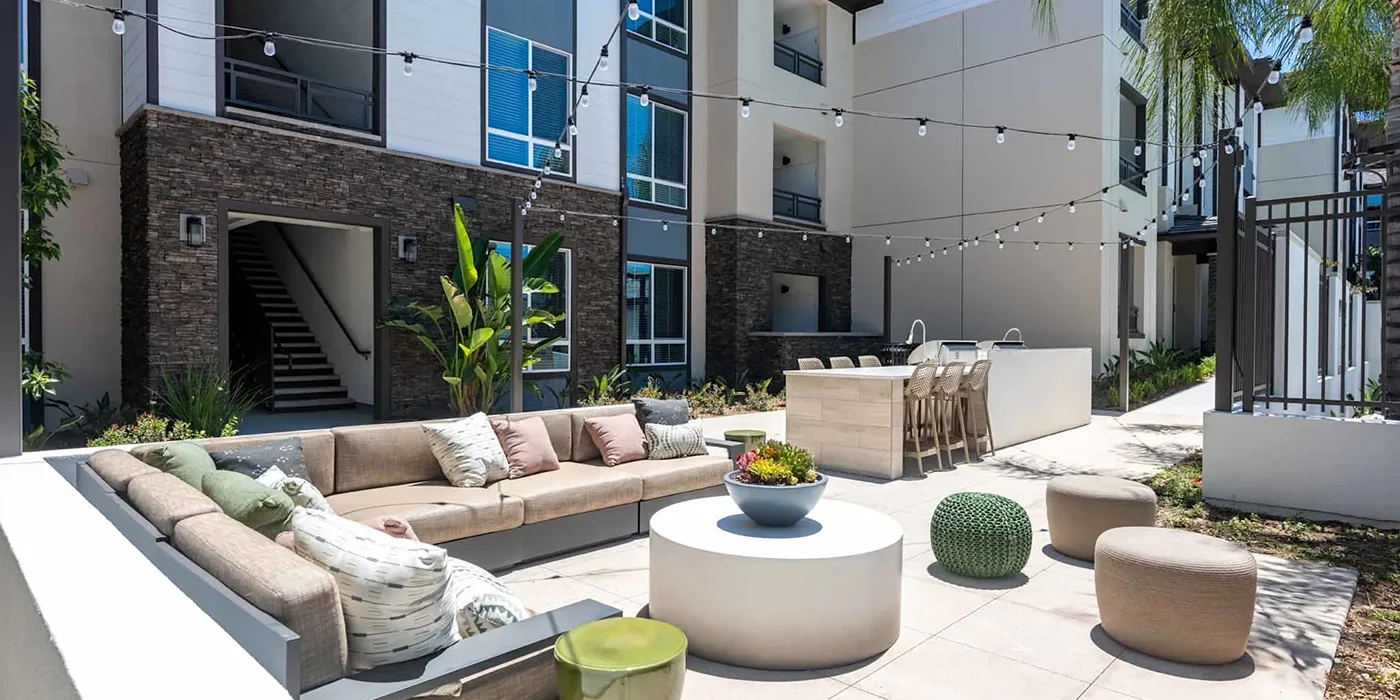
Exterior color, monument signage, mastheads, interiors, and leasing materials formed one arrival story. The work integrated brand decisions into the building and prospect journey instead of placing a logo on a finished property.
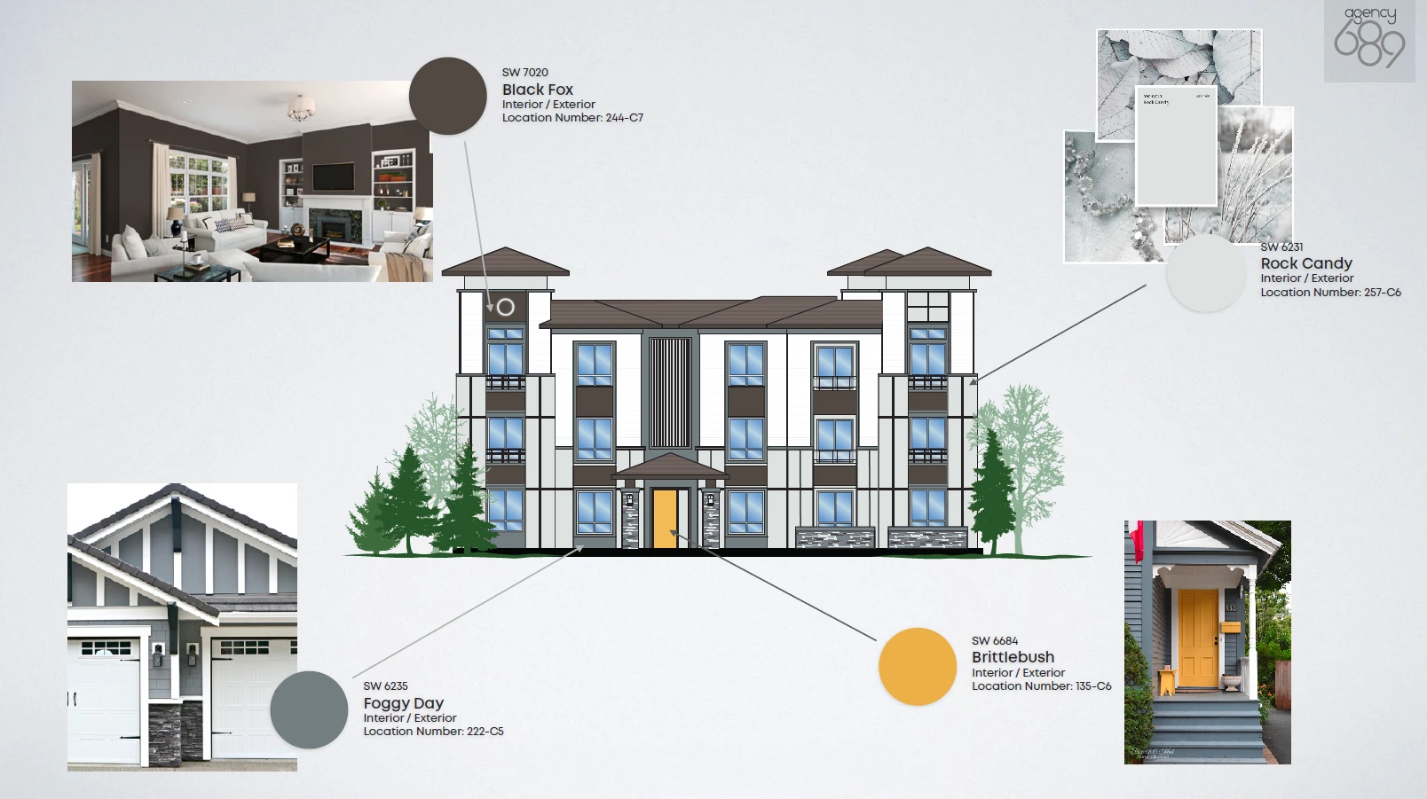
Brochures and presentations gave the leasing team a practical expression of the same position and visual discipline.
Facing a similar challenge?