
A connected hotel-brand family designed to make a growing West Coast portfolio easier to understand.
00 / Overview
A brand architecture that made the portfolio easier to navigate.
Agency689 created a brand architecture and identity system that connected Oxford Collection’s hotels while preserving each concept’s role.
Agency role Lead strategy and creative partner
Client Oxford Collection
Services Hospitality Brand Architecture / Visual Identity / Hotel Logo Design / Supporting Marks / Typography / Color Standards / Brand Guidelines
01 / Brand Architecture
One collection. Distinct ways to stay.
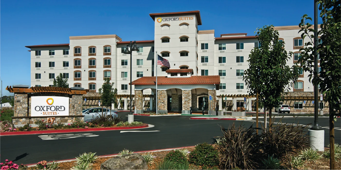
Defined roles, four primary logos, and supporting marks created shared recognition while letting Oxford Collection, Oxford Hotel, Oxford Suites, and Oxford Reserve stand on their own.
02 / Hotel Logo System
A hierarchy guests and teams could recognize at a glance.
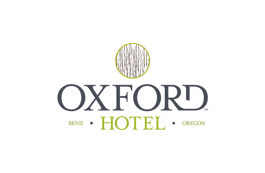
Shared proportions, typography, and visual cues connected four primary logos and their supporting marks while allowing every brand to function independently.



03 / Brand Standards
Rules that protect consistency without erasing place.
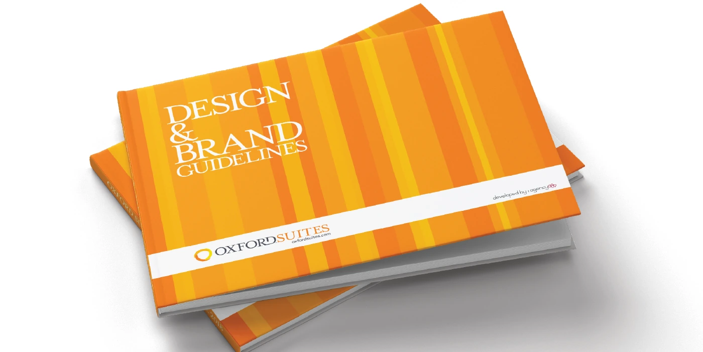
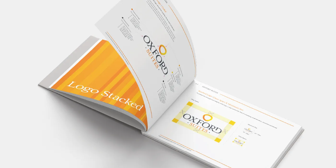
Guidelines defined logo use, supporting marks, typography, color, and application principles, giving property teams practical direction and room to reflect their locations.
04 / Brand Applications
From portfolio standards to guest-facing communication.
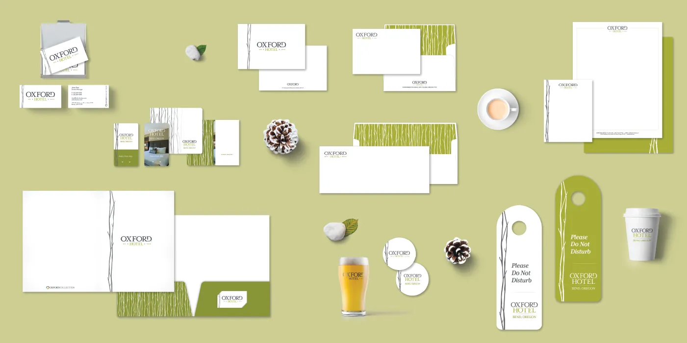
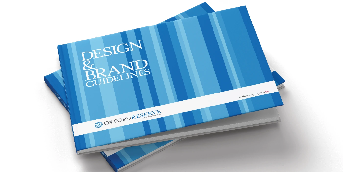
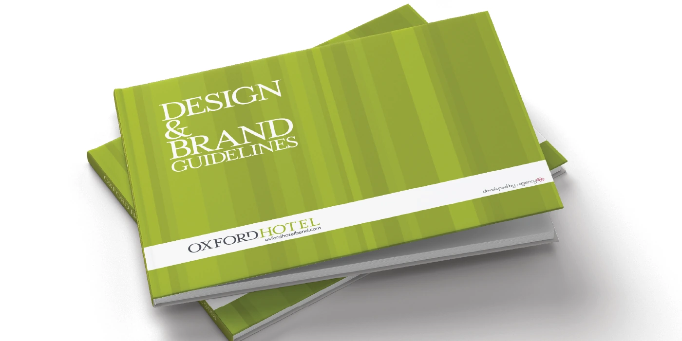
Brand books, collateral, and advertising demonstrated how the architecture worked in practice across properties, campaigns, and internal teams.

05 / Project Outcome
A portfolio people could understand and teams could manage.
The system strengthened collection-level recognition, property-level distinction, and consistency across guest communications.
Facing a similar challenge?